Elizabeth Arden Red Door Salon | Website Redesign (Archived)
Art Director
I redesigned Red Door’s website to make booking faster, navigation clearer, and services easier to compare, while elevating the brand’s premium feel. After launch, the site showed measurable improvements, including stronger conversion on booking actions and improved engagement across key pages (sessions, time on site, and bounce rate), supporting business goals while the site was live.
What I delivered: Home, service landing, booking flow, responsive screens
My role: Art direction + UI/UX + IA, partnered closely with stakeholders
Results: Stronger booking actions and engagement while live (sessions, time on site, bounce)
Project note: The business later closed due to COVID-era impacts; this case study reflects the work completed while the site was live.
Home Page
The homepage needed to feel like walking into Red Door, elevated and easy to navigate. I built a simple, tile-based layout so guests can get to the right service category fast, without hunting. Strong photography and clear hierarchy do the heavy lifting here. The goal was a homepage that feels premium, but works hard by getting people to booking faster.


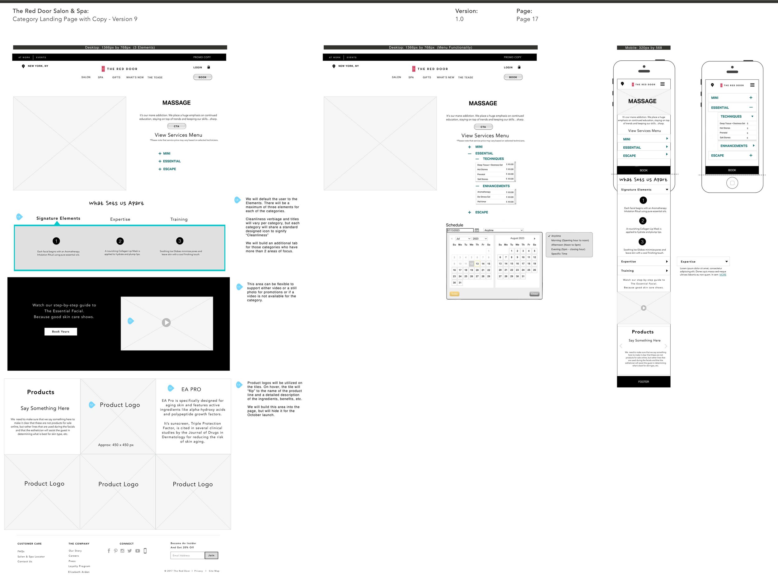
Landing Page
The landing pages were designed for decision-making. Instead of making people read paragraphs, services are organized so you can compare options by time and price right away. From there, the experience moves into personalization (techniques and enhancements) while keeping the path to booking obvious. It’s guided, but not pushy, and it helps guests choose with confidence and schedule faster.
Service category hover states.

Tier selection by time + price

Enhancements with running total

Date/time selection

My Bag summary